Sometimes you’ll look at one printed piece and then another one that’s very similar. But one just looks better than the other and you can’t put your finger on why. It may be because the creator of the better looking piece knew how to use type. You can too and it’s not hard. Following are a few typographic niceties that the pros use all the time.
1. The Apostrophe
The improperly-used or non-used apostrophe is one of my pet peeves. You see the error all the time and you probably don’t even notice it. After you read this, you’ll see it every day. As you were taught in elementary school, the apostrophe indicates a contraction, such as “can’t” for “cannot.” It’s also used with a truncated number, especially when referring to a year. For example:
‘20 Ford Mustang
See anything wrong? Maybe the topic has given you a clue. The first character in the line above is a single open quote, when it should be an apostrophe! It should read:
’20 Ford Mustang
I admit it can be difficult to get Word or InDesign to do this, but please make the effort. If you’re using a Windows PC, you can use the Alt+0146 shortcut. On a Mac, it’s Option + Shift + ].
Get this one right. You’ll feel better.
2. The Ellipsis…
The ellipsis looks like three periods strung together, but it’s not. Sure, you can type three periods, but that’s not an ellipsis. The ellipsis, which indicates a gap in the text, is a unique typographic character (Win: Alt+0133; Mac: Option + ;).
There are several good reasons to use the real character:
- An ellipsis always has round dots except in the most bizarre fonts while a period is sometimes a square, diamond or another shape.
- The spacing between three conjoined periods is usually different than an ellipsis.
- It won’t break at a line ending.
3. The Em-Dash, the En-Dash and the Hyphen
Most people know about the em and the en because they are great words to use when you’re trying to squeeze out a few points at the end of a Scrabble® game. But the em-dash, en-dash and the hyphen are not interchangeable. They are to be used in specific cases:
The em-dash (Win: alt+0151; Mac: Option + Shift + hyphen key) is sometimes used to indicate a long pause which gives more emphasis than a simple comma. For example, “The 1966 Pontiac GTO—arguably the best looking year for that model—is a favorite among car collectors.” You can use them singly, as well, as in “The pizza boy just delivered my favorite pizza—thin crust, double pepperoni and anchovies.” Some people put a space on either side of the em-dash. I don’t, but it’s a matter of personal preference. And, please, don’t use two hyphens unless you have no choice. If you find it easier to use two hyphens, go ahead. Just use “Find & Replace” to make the two hyphens into an em-dash.
The en-dash (Win: alt+0150; Mac: Option + hyphen key) is best used to indicate a range. For example, “The classroom is available 4:15–6:00 p.m. and we’ll be reading pages 161–175 in the textbook.” It’s also used as a compound modifier for multiple words, such as, “Soon, we hope to enter the post–Covid-19 era.”
Finally, the hyphen. It’s main reason for being is to be used in compound words preceding a noun. I know, grammar school again. But, depending on where it is placed or not, a hyphen can change the meaning of the sentence. For example, “The fat-tired GTO left wide skid marks.” Written this way, it indicates a car with wide tires. Leave out the hyphen and you’ve got a car that’s overweight and exhausted. So, when you want to make sure the two modifiers are clearly linked for the reader, use a hyphen.
4. Feet and Inches
Here’s another pet typographic peeve. Using apostrophes and close quote marks instead of the proper characters that indicate feet and inches. Have you ever gone down the highway and seen a big sign announcing:
Lane Ends 1500’
Why is there an apostrophe? It should read:
Lane Ends 1500′
That last character is a proper symbol for a foot. The same thing goes for inches, so a tall person would not be 6’ 4” but rather 6′ 4″.
Finally, these same characters are used with coordinates in latitude and longitude along with the degree symbol. For example, Paris, France is located at approximately latitude 48° 51′ 23.8068″ N and longitude 2° 21′ 7.9992″ E.
5. Ligatures
No, we’re not referring to something you might strain, that’s a ligament. A ligature is a holdover from the days of hand-set typography. When you have more time, I’ll explain how ligatures came to be. Anyway, ligatures are two or more thin characters combined into a single character. Doing so makes the inter-character spacing much more attractive. Here is an example of a word with and without using ligatures:
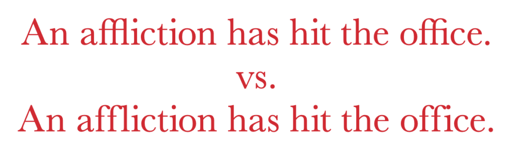
The first sentence uses ligatures while the second does not. Look at the “ffl” and “ffi.” The differences are subtle, but throughout a document it can make a difference. Frankly, not enough of a difference if this had to be done manually. But with InDesign—and other programs, I imagine—it’s simply a matter of checking the box. Better yet, make it a default.
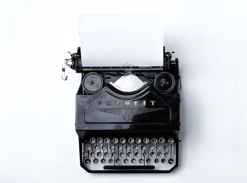
6. Two Spaces or One?
This seems to be one of those generational things. Those of us who were taught (or at least they tried to teach us) to type on a typewriter were told to hit the space bar twice at the end of a sentence. Those who first learned on a computer keyboard may never have picked up this habit. Almost everyone agrees that a single space is all we need, but what do you do if you just can’t break the habit? Or worse, sometimes it’s two spaces and sometimes it’s just one.
The solution is easy. Just type away and when you’re done use the “Find & Replace” to change every two taps of the space bar with a single one. This works fine so long as you didn’t use multiple hits of the space bar to move characters to where you want them on the page. But, you wouldn’t do that, would you?
7. Now is Not the Times
The most common default typeface is Times New Roman (not New Times Roman). Times, as it is usually referred to was designed by Stanley Morison in the early 1930s to replace the old typeface used by the London Times. It was designed as a naturally condensed font so that more text could fit on each newspaper page. Do you really want your documents to look like an old newspaper? I hope not.
So, pick a different font and once you find one that fits you or your organization’s personality stick with it. There are lots of classic and new faces available. Where once type had to be drawn by hand, letter-by-letter, today’s type designers can spew out a font very quickly. That’s why you have to be picky when choosing your typeface.
There are a number of good sources. Two of my favorites are: Linotype or MyFonts.
Type is cheap so try a few out. But, please, don’t choose Comic Sans.
Feel free to reach out to us if you want to learn more about how to use typography effectively in your next print project. Give us a call at 703.478.5252 or send us an email through the button below.